Logo signs refer to signs that prominently display a company or organization's logo. These signs are designed to visually represent the brand and create immediate recognition.
Logo signs are used in various contexts, such as storefront signs, office spaces, event branding, vehicle graphics, wayfinding signs, digital signs, and more!
In this article, we will examine why logo signs are important, tips for designing one, and give you some examples of quality logo signs.
Click on each corresponding link to jump ahead:
At AGC Signs, we design, manufacture, and install high-quality signs that last! If you need help designing your logo, contact us today!
Logo Signs Explained

If you don’t have a quality logo, you need one!
1. The Importance of Having a Quality Logo
A quality logo holds significant importance for businesses and organizations, and here are several reasons why:
a) Brand Identity
A logo stands as a visual representation of a company's brand, playing a crucial role in crafting a distinctive and memorable identity for easy customer recognition.
A well-designed logo significantly contributes to brand recall and helps set the brand apart in a competitive market, particularly when showcased on various platforms, including logo signs.
B) Brand Recognition
A quality logo makes your brand easy to recognize!
The strength of a logo lies in its ability to contribute to brand recognition. As customers become acquainted with a logo, there is a heightened likelihood that they will remember and choose that brand over others.
Consistent use of a logo across diverse platforms and marketing materials serves to reinforce brand recognition, making it a pivotal asset for logo signs and other promotional efforts.
C) Professionalism and Credibility
A professionally designed logo conveys an impression of credibility and competence. It signals to the audience that the business is well-established and takes its image seriously. This, in turn, fosters trust among:
Customers
Clients
Partners
This reinforces your brand's reputation and suitability for logo signs representing the business.
D) First Impression

If you want to make a great first impression, go big!
Often serving as the initial point of contact, a logo is the first thing people notice about a company. Functioning as a visual introduction to the brand, a well-crafted logo has the power to create a positive and enduring first impression.
This is particularly crucial for logo signs, where a visually appealing and thoughtful logo can influence how people perceive the business from the outset.
E) Communication
Logos serve as powerful communicators, conveying a wealth of information about a company's:
Values
Personality
Industry
Elements such as colour, shape, and typography in a logo can effectively communicate a message that resonates with the target audience, a consideration of utmost importance when designing logo signs that need to convey the essence of the brand succinctly.
F) Marketing and Advertising

A quality logo opens up opportunities for interior signs as well.
Integral to marketing and advertising efforts, logos find a place in:
Business cards
Websites
Social media profiles
Advertisements
Other promotional materials
A well-designed logo enhances the overall effectiveness of marketing campaigns, attracting attention and fostering brand recall. This versatility makes logos essential assets for logo signs and diverse promotional mediums.
In summary, a quality logo serves as a cornerstone of a company's comprehensive branding strategy. It actively shapes public perception, fosters brand loyalty, and contributes significantly to the overall success of the business, making it a crucial element for logo signs and beyond.
2. Tips for Designing a Logo
When crafting a logo, it's essential to contemplate how it will appear on logo signs! This involves striking a balance between creativity and practicality.
Here are some tips for designing a logo with a specific focus on visibility on logo signs:
A) Simplicity is Key
Keeping the design simple is crucial when envisioning how it will translate onto logo signs. Avoid overly complex elements, as a clean and straightforward logo is more likely to be recognizable, especially from a distance on a sign.
B) Scalability

The red apple looks great big or small!
Ensure that the logo looks impressive and remains legible when scaled up or down for logo signs. This is vital for maintaining visibility on various platforms, including signs of different sizes.
C) Colour Contrast
Enhance visibility by using contrasting colours, especially when considering the background colour of the logo signs. Opt for colours that stand out against the background, as high contrast significantly improves readability, even from a distance.
D) Readability

Opt for logo signs that are simple and easy to read.
Prioritize legibility for both text and graphics within the logo, especially when it comes to logo signs. Choose a clear and easily readable font for any text components. Steer clear of overly decorative or intricate fonts that may pose challenges in deciphering from a distance on signs.
E) Versatility
Design a logo with versatility in mind, ensuring it works well in various formats, including black and white for logo signs. This ensures that the logo maintains its impact when reproduced in different contexts, such as on monochrome signs or in print.
F) Consider Sign Placement

Wherever you place your sign, ensure it matches the surrounding aesthetic.
Contemplate the placement of the logo signs and design accordingly. For instance, if the logo signs will be displayed on a building facade, consider how the logo will interact with the architecture to ensure a seamless integration.
Remember, a well-designed logo not only looks good on logo signs but also serves as a powerful tool for brand recognition and communication. Taking practical considerations into account ensures that your logo remains effective in various applications, including signage.
3. Examples of Quality Logo Signs
Here are some quality logo signs we took part in! Feel free to use these as inspiration:
A) The Craft Brasserie & Grill

This quality logo sign features a large circular sign along with an awning. Both of these elements include this companies logo, “The CRAFT”.
Not only is this font used easy to read, but the white text stands out with the black background.
B) Physio & Wellness Centre
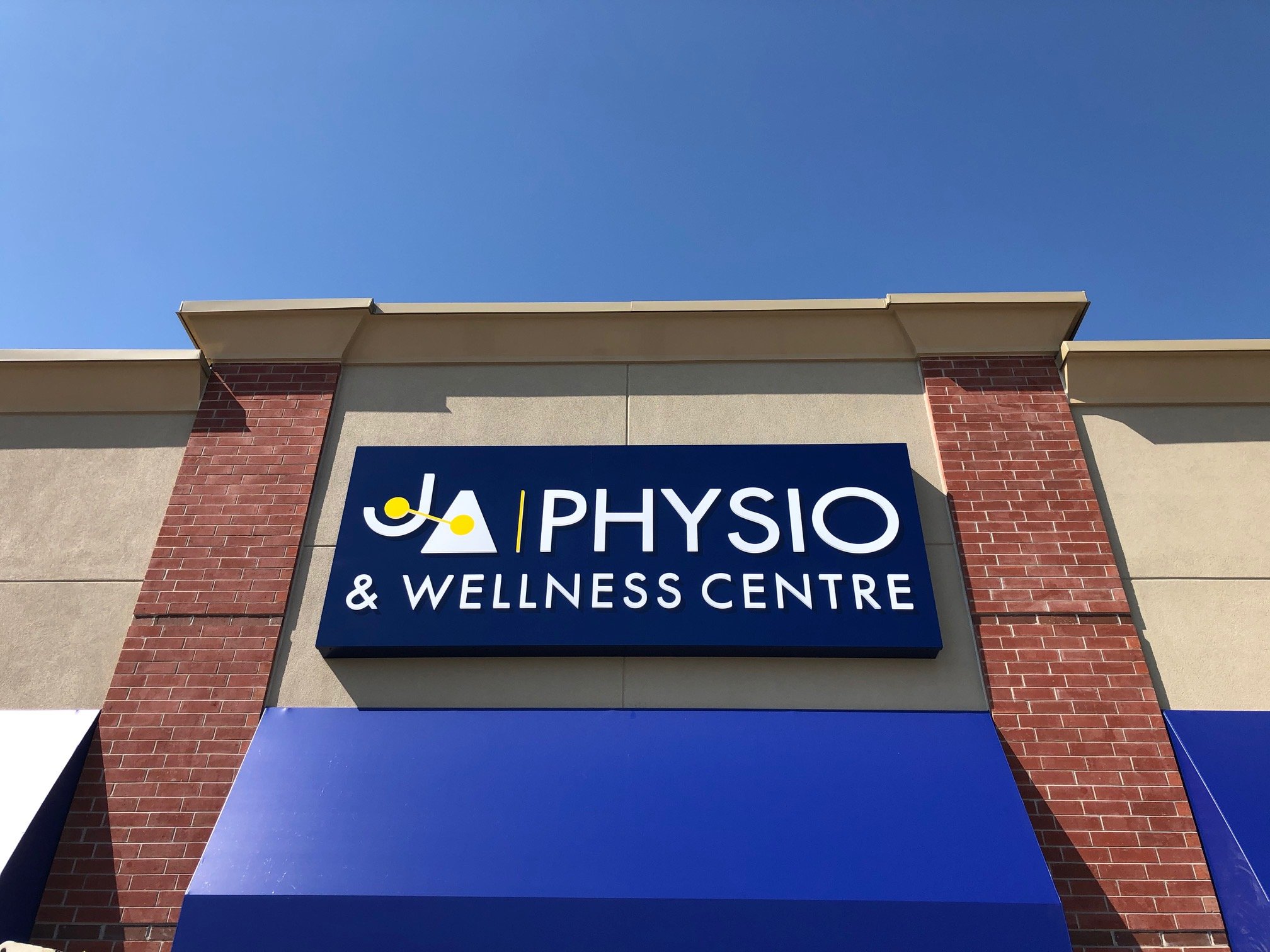
When it comes to the quality logo signs we have erected, this one stands out.
As you can see, the logo is the first thing you notice on this sign, followed by the name of the business. This is mainly because the white text pops out from the navy blue backdrop.
C) New Age Physio

This logo sign also stands out!
As you can see, we have white text displayed on a dark grey canvas, which makes the text pop!
Although the logo is not the first thing displayed, because of its size and unique look, it stands out very well. The logo is masterfully displayed!
Do You Need New Logo Signs?
For the past 10+ years, we have been designing, manufacturing and installing logo signs in Durham region (Clarington, Ajax, Pickering, Bowmanville and surrounding areas). You can trust us to do the job right!
Regardless of the size of your business or organization, If you want to stay on top of your industry, you need to take action! Contact us to discuss your signage needs.
We do all of the work ourselves and never subcontract it out. Contact us today for a free quote!
What Our Customers Are Saying…
“I have an indoor sign, a storefront sign, and a pylon sign from AGC. They all look great (especially the 3D lettering indoors). The whole team was very flexible and understanding of our needs. Lots of compliments on all of our signs. 5 stars!” - Jen Heffernan


